JINS Packaging Series

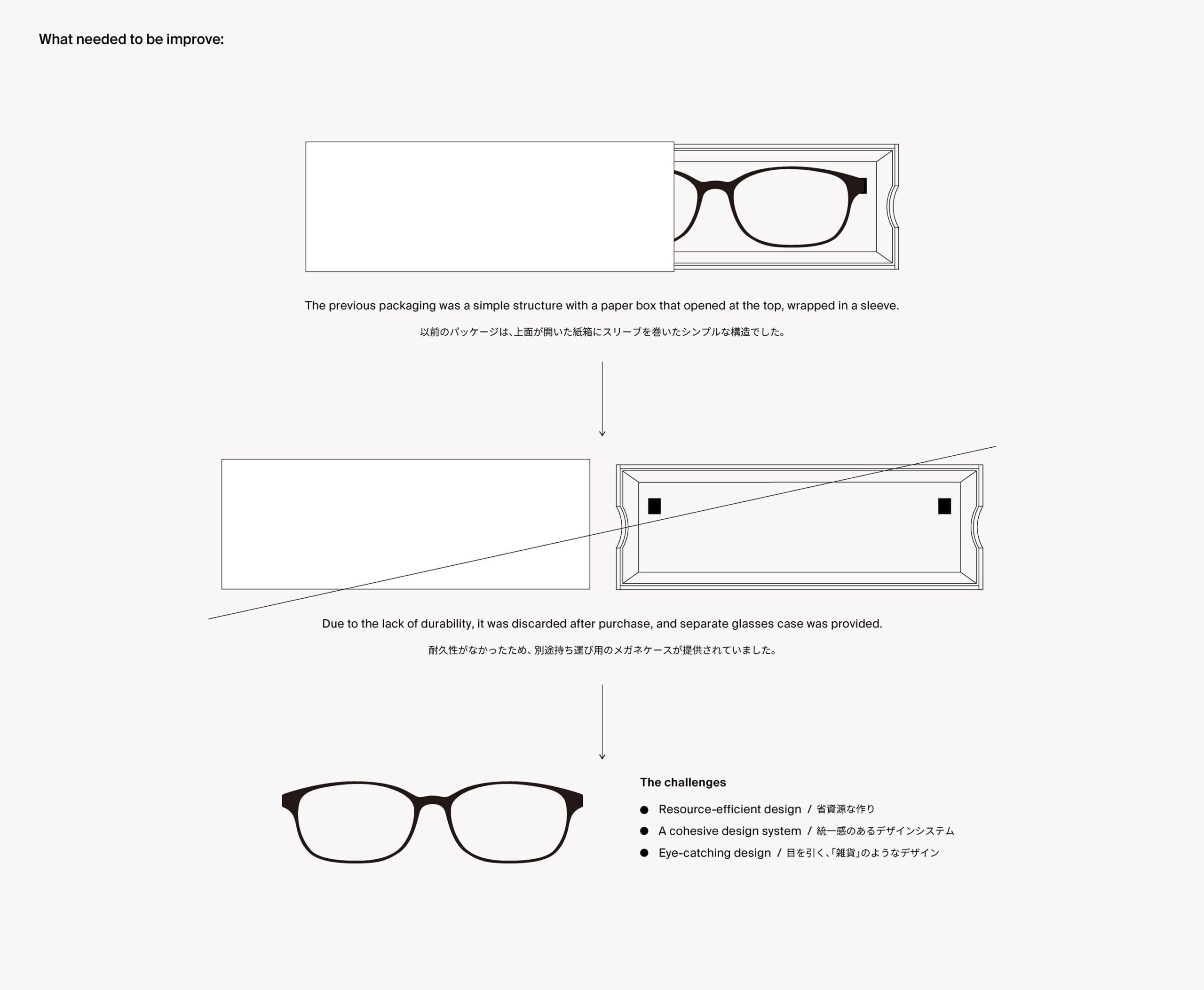
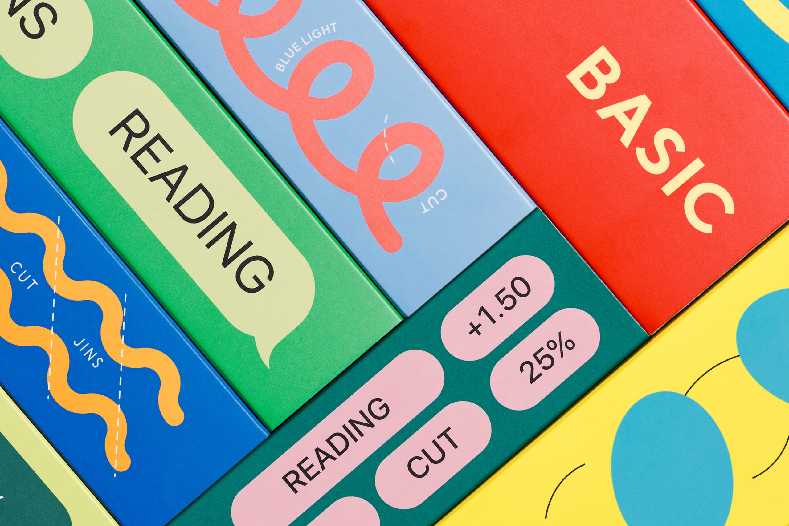
JINS offers a range of glasses catering to various needs such as blue light protection, reading, and pollen prevention. However, the design of each series had been inconsistent, and there was an issue where the packaging and the case provided at the time of purchase were mismatched in stores.

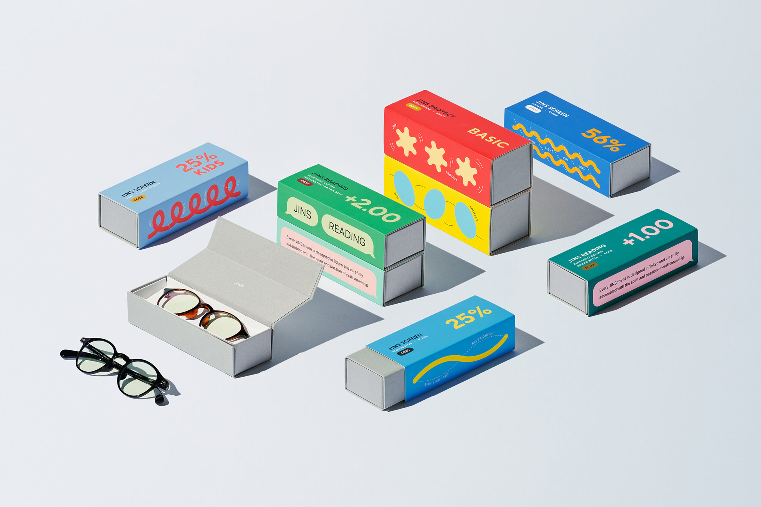
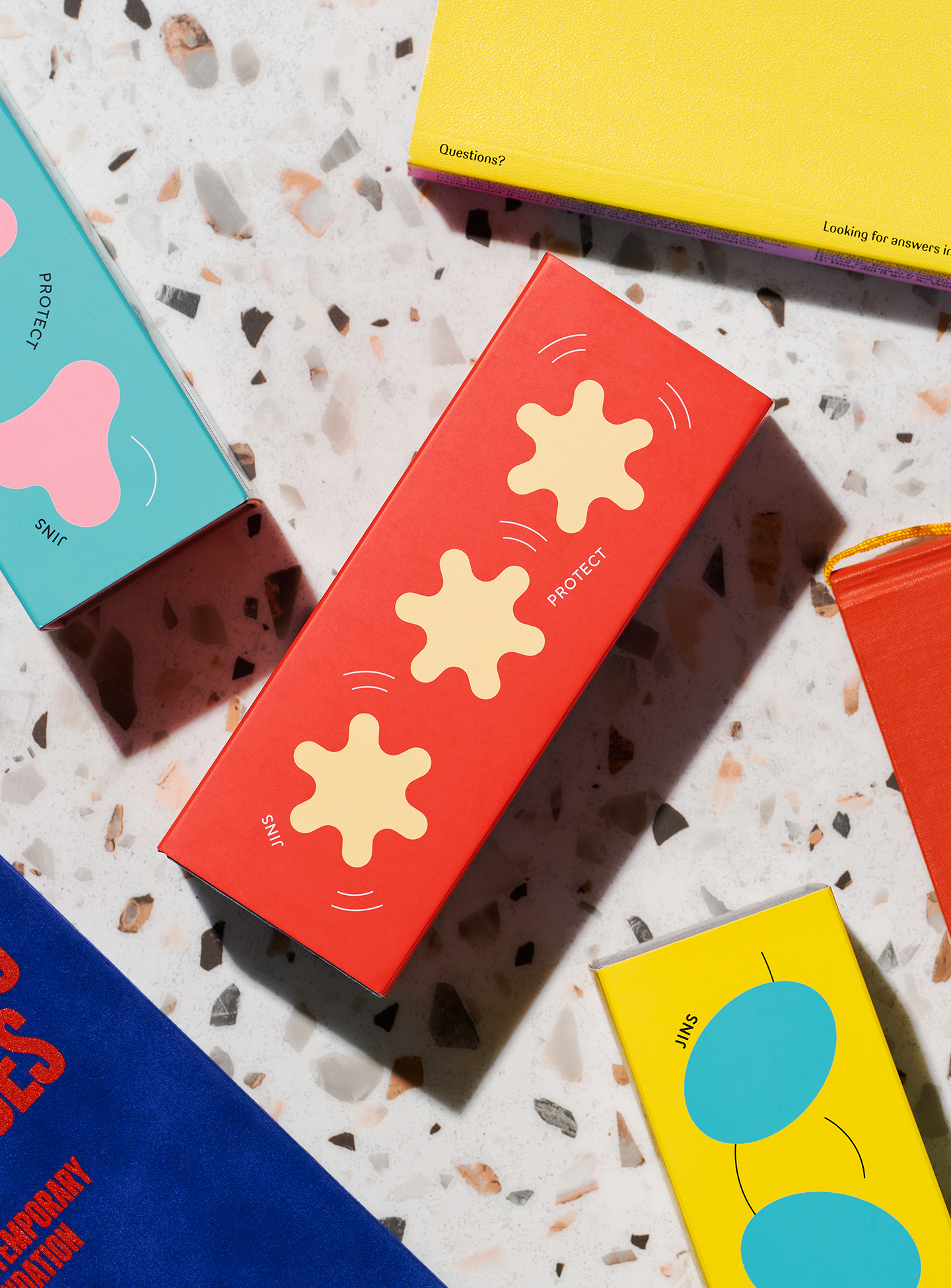
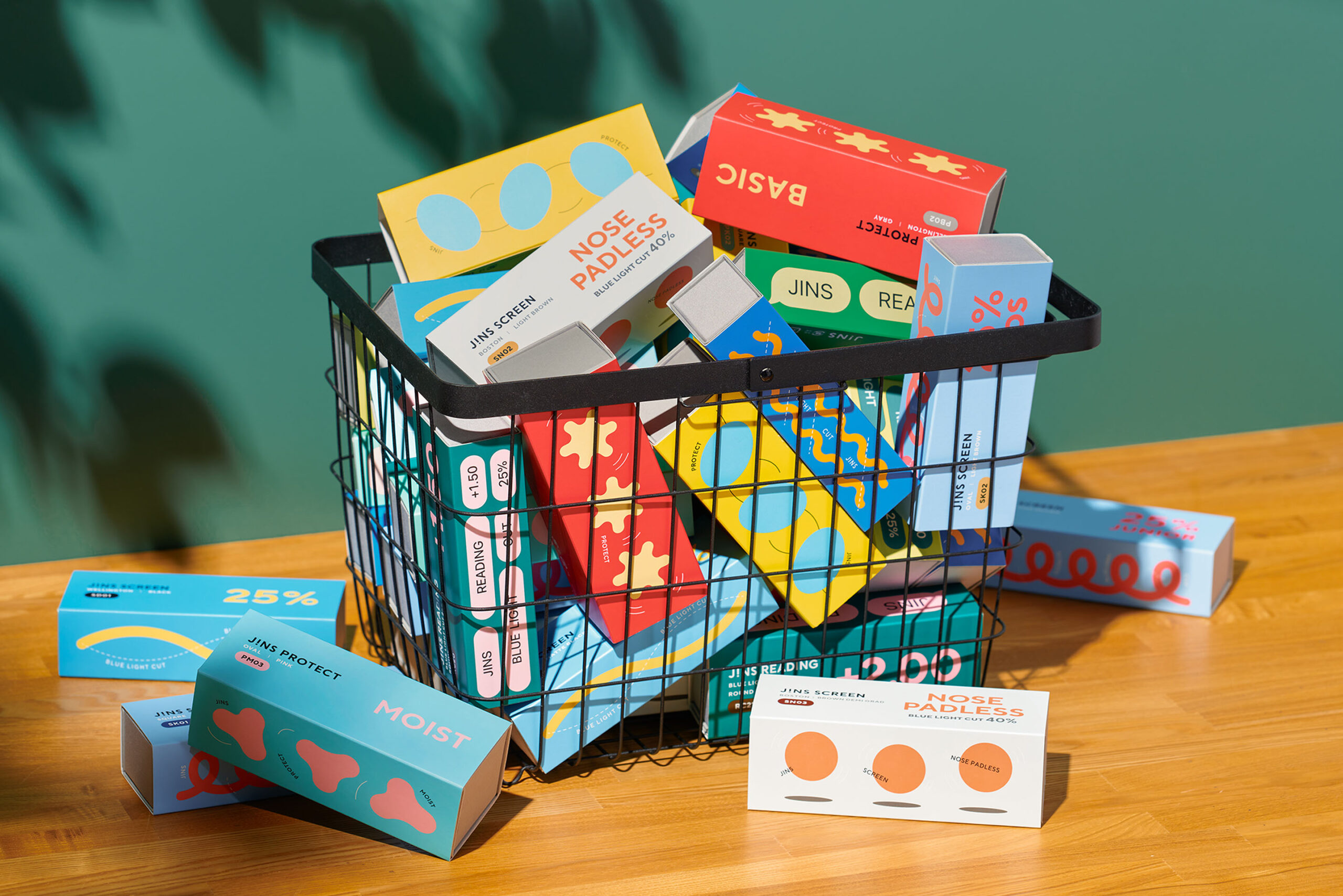
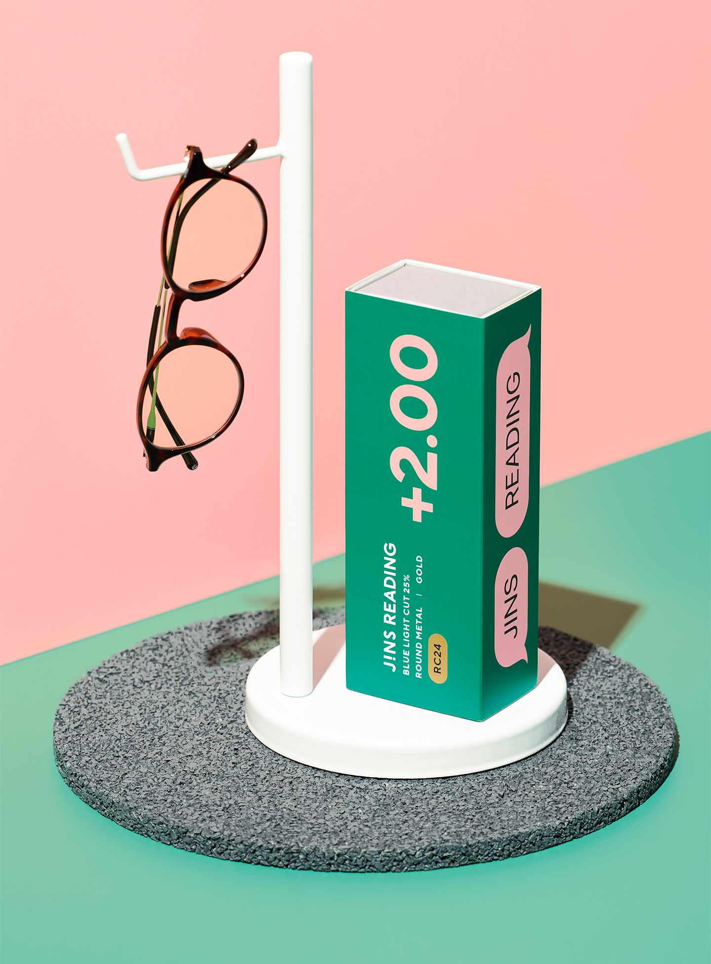
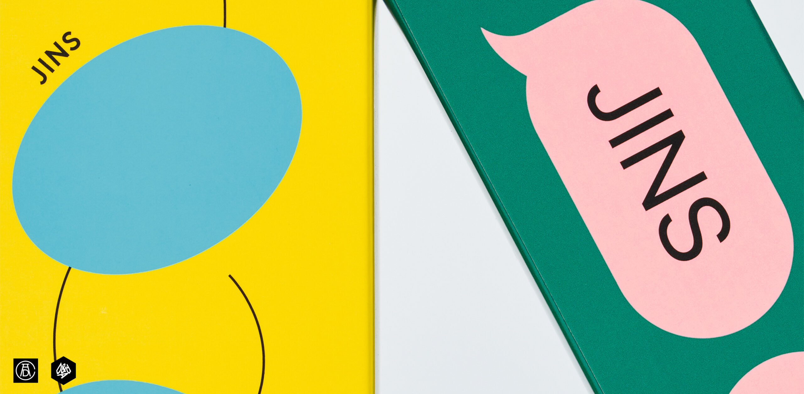
In this design project, the packaging was completely reworked. The various series were organized, and a unified design system was developed to ensure consistency across the product line. Excessive packaging was eliminated, and a resource-efficient case was designed to serve as a carrying case post-purchase. To further enhance the customer experience, vibrant color schemes were incorporated into the design, elevating the enjoyment of selecting a product.

Through this project, JINS created a new value by offering not only functionality but also the joy of selection and the satisfaction of use.

Award

ADC 2024
D&AD 2024
JAPAN PACKAGE DESIGN AWARDS 2025

01Design Solution

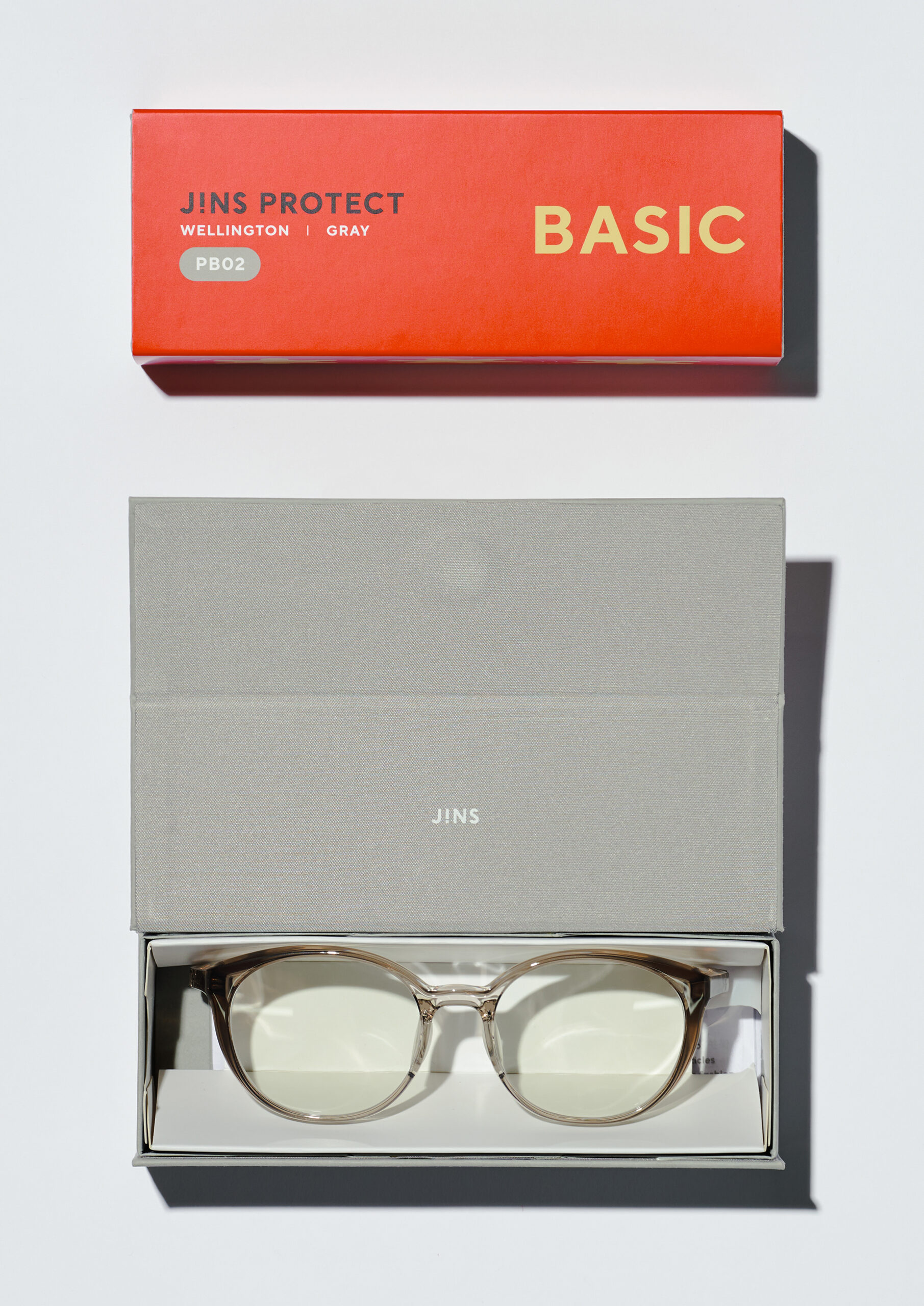
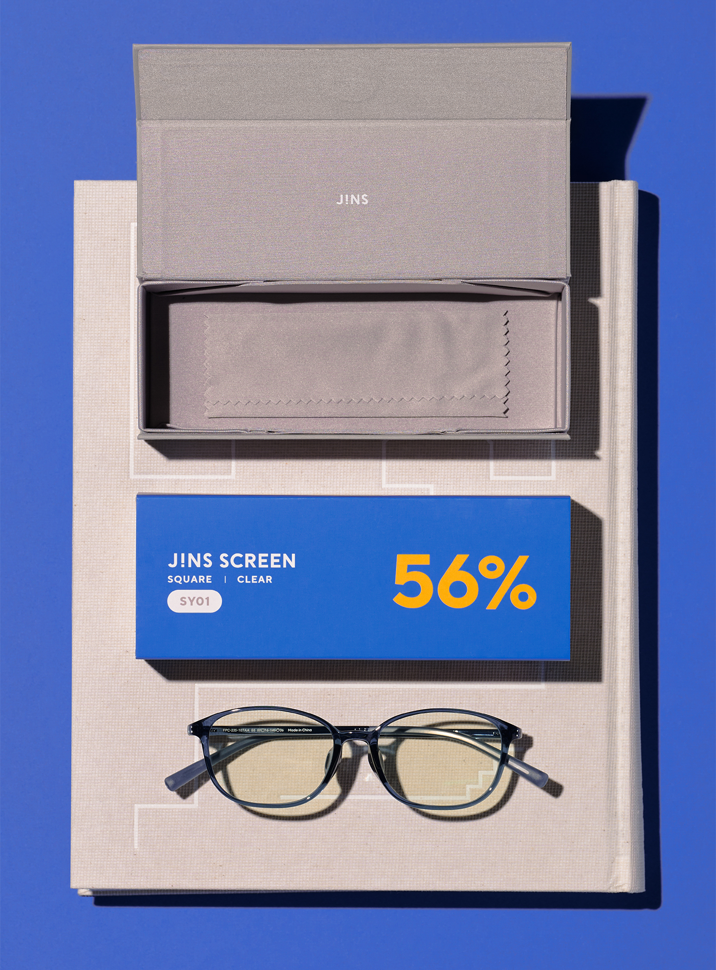
Originally, customers received a separate carrying case for the glasses in addition to the packaging used for shipping. In the design overhaul, the structure was simplified to a paper-based glasses case wrapped with a paper sleeve. This new packaging design allows the case to be used as a carrying case even after purchase, offering both convenience and sustainability.

/04

02Communication design

The functional glasses series, with its variety of features, prescriptions, shapes, and uses, faced the challenge of improving ease of selection. To address this, we logically organized the products to make them as clear as possible, creating an intuitive selection process for customers.

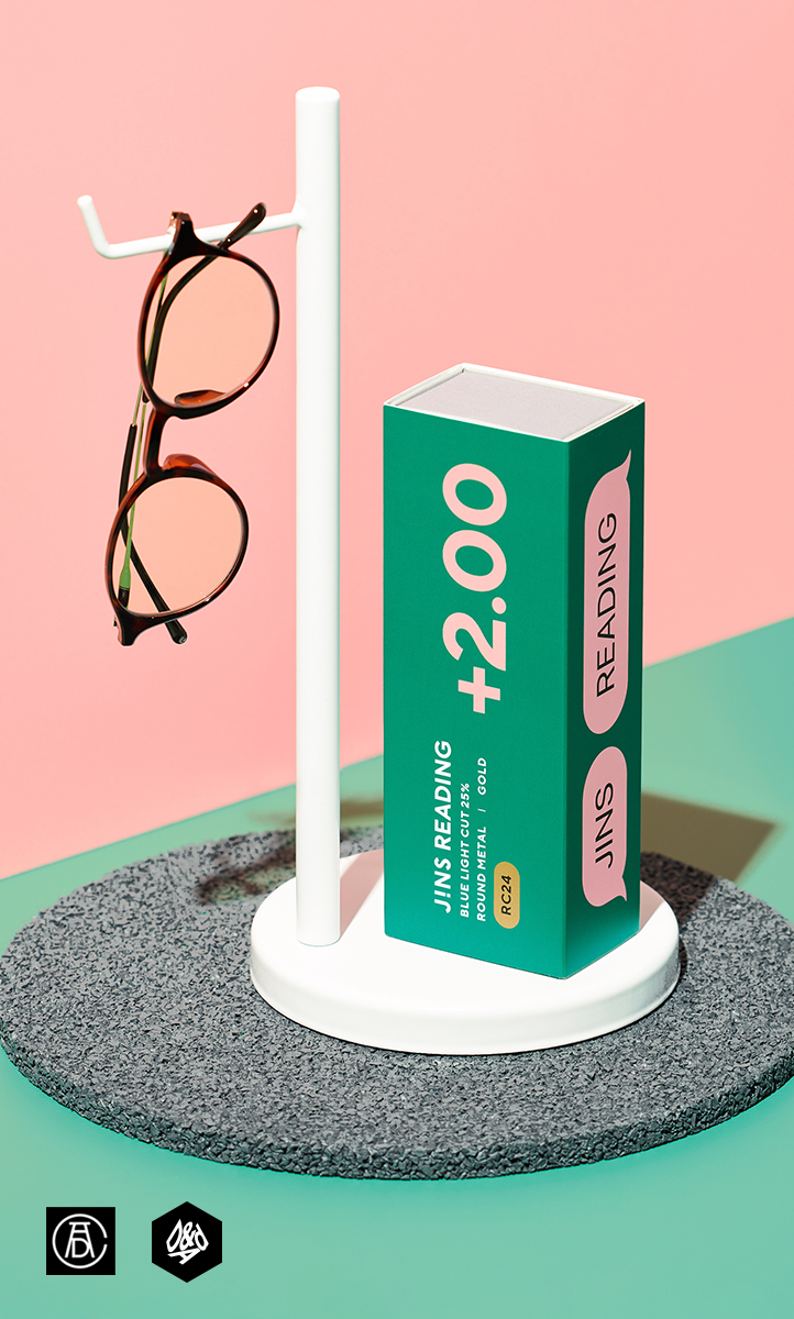
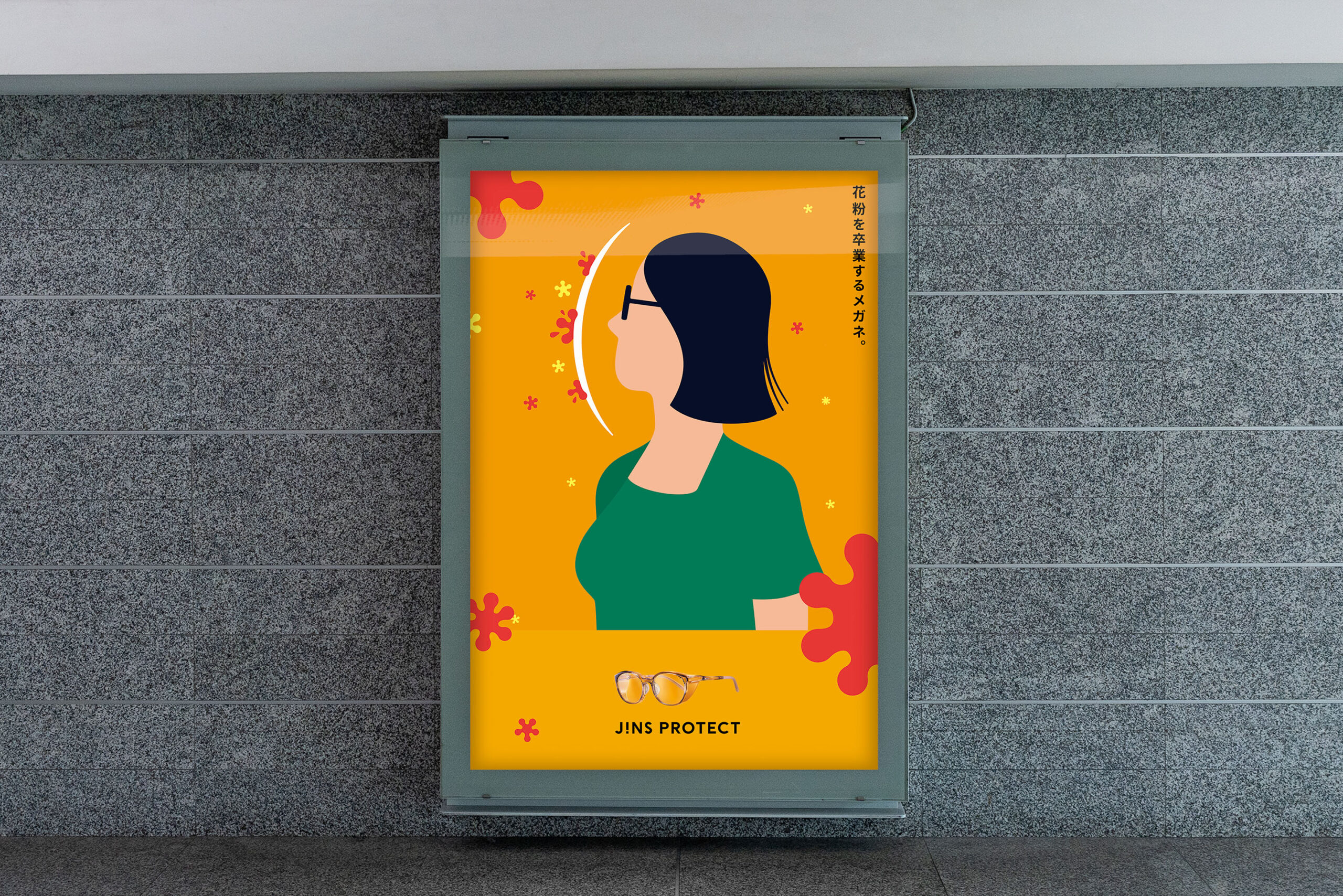
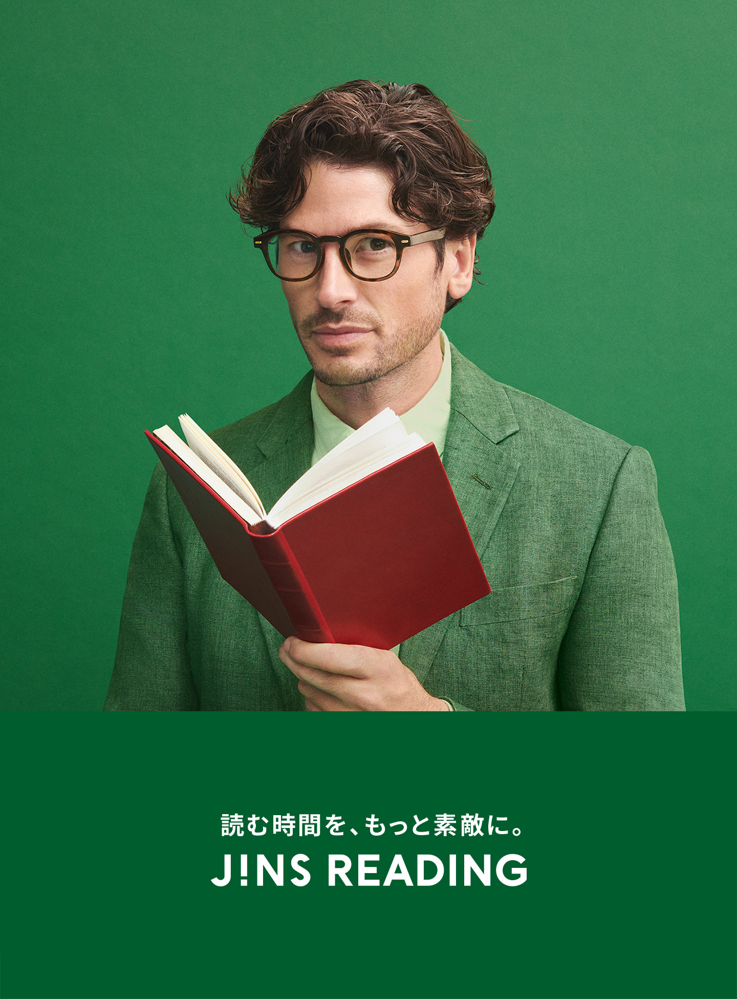
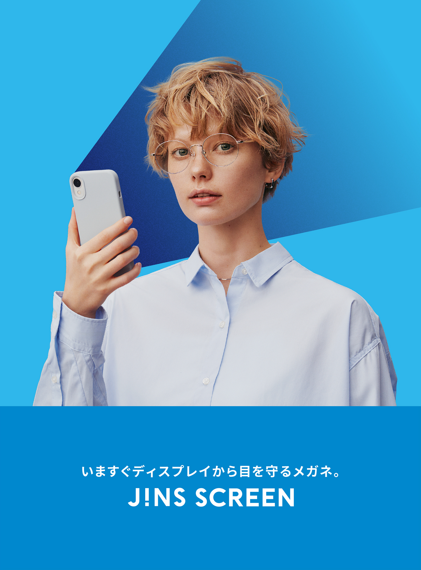
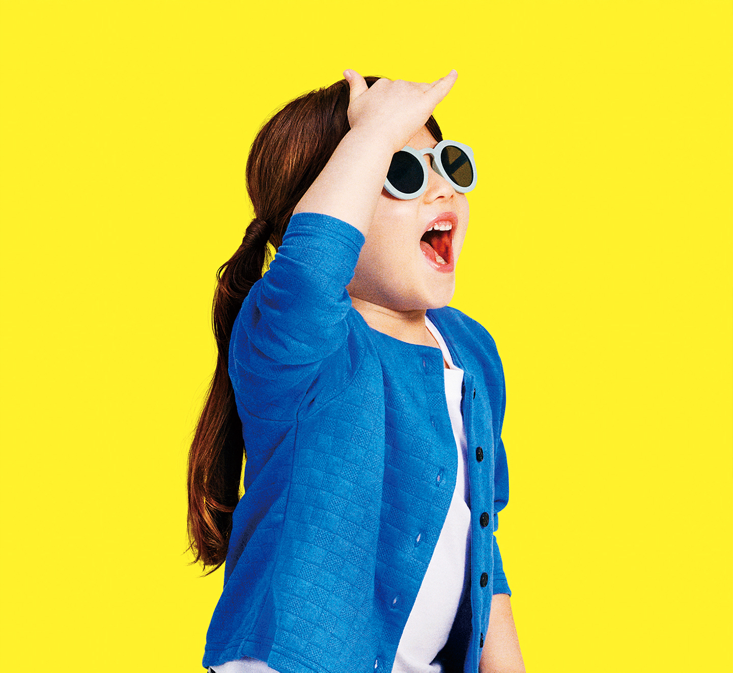
The design goal was to create a charm that makes the glasses feel like an irresistible item, similar to a desirable piece of everyday goods. The case, made from recycled paper, can be used as a durable carrying case once the colorful sleeve is removed, showing consideration for the environment. Building on this packaging design, we developed graphics and created cohesive designs for in-store posters and the website's key visuals. This approach provided a visually integrated brand experience.

/04

A fun "lifestyle goods" vibe that makes you want to reach out.

More Projects